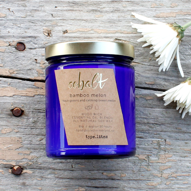
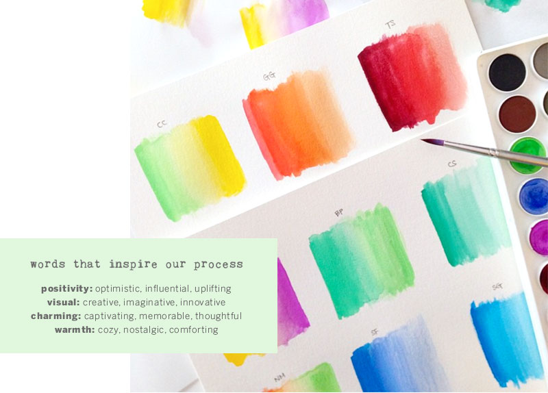
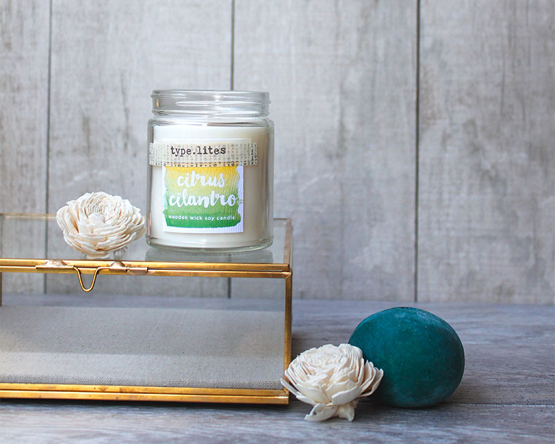
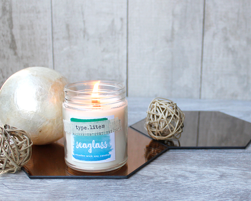
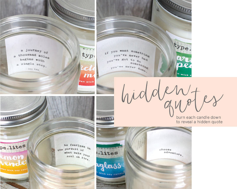
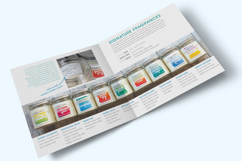
The redesign of our signature line was inspired by a handlettering watercolor class that we took early 2015. We wanted to create a look and feel that was bright, playful, and uplifting. There were elements from our original packaging that were unique to our brand so we knew our upgraded look would be a blend of old and new components. The labels were updated to feature unique watercolor brushstrokes on woodgrain textured paper and topped off with our signature tape and a bit of typography underneath. The final element, and arguably our favorite, is the hidden quote that is revealed as the candle is burned down.
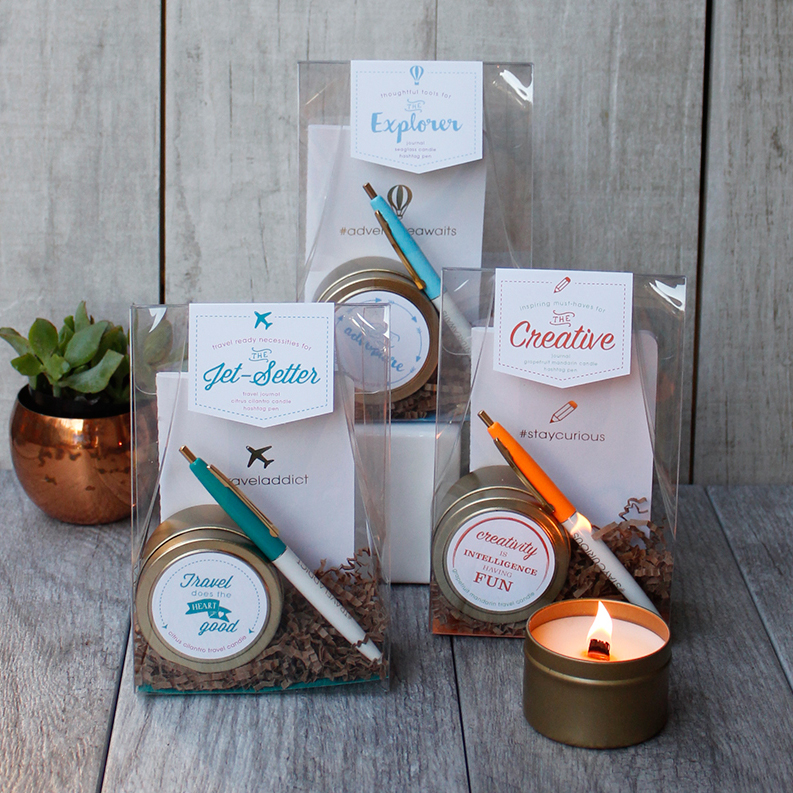
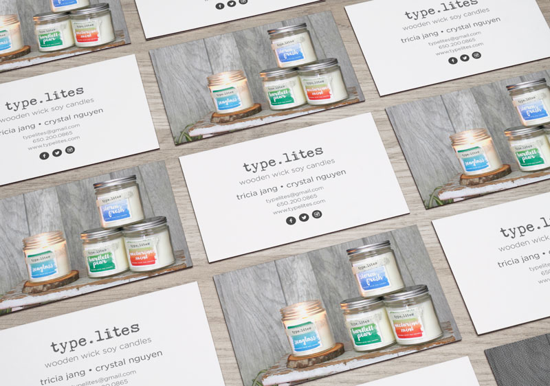
Services Rendered: Brand Strategy, Packaging Design, Logo Development, Printed Material, Digital Graphics, Social Media Launch Campaign, Photography
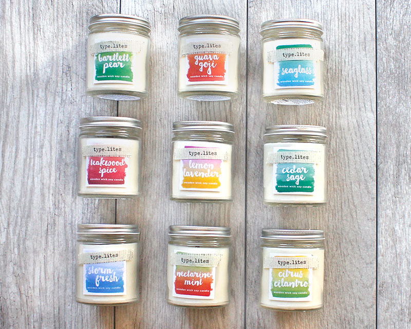
More type.lites